
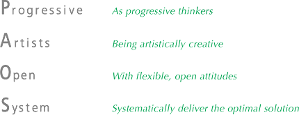
The PAOS brand takes the initial letters of the company philosophy, Progressive Artists Open System, and was conceived when the company was in its inception as a means of giving tangible expression to our unique approach to the design business. The name incorporates our desire to be "Progressive Artists" (a group of forward-thinking creators of beauty) operating within an "Open System" (a flexible organization capable of offering the best solutions to client problems). At the time, this neologistic "philosophy brand" was a rarity.
The PAOS logo combines four circular motifs. It is designed to symbolize the four processes of PAOS' work: "problem identification" → "strategy formulation" → "creative development" → "communication and execution".

The circles employed as the base element express the sphere of PAOS' business as a cosmos, while the horizontal and perpendicular lines traversing the circles are for axis and orientation as necessary to maintaining focus. Circles, squares and triangles have been placed at the center of each of the circles to represent the three basic elements of dimensional expression. The vertical division of the circles is used to demonstrate our belief in the importance of considering all ideas and actions in terms of the dichotomy between yin and yang. The arrows around the outside, meanwhile, express the time line in each phase and the dynamism and direction of our work, with the 4 differing directions symbolizing the PAOS approach, which starts with a broad-based accumulation of information gathering and analysis followed by the output of optimal solutions representing the distillation of our ideas.
![]()
![[study] PAOS' Research and Application Projects](../common/images/methodMenu/study.gif)