

![]()
![]() Place your cursor over the logo to reveal its former incarnation.
Place your cursor over the logo to reveal its former incarnation.

The Mainichi Newspaper, Japan's oldest broadsheet, was facing a trilemma: its editing, marketing and advertising policies all ran afoul of rival papers. Findings from research conducted following our commission from the Mainichi revealed that, while both the Yomiuri and the Asahi – rival broadsheets – had a powerful public image, resistance to the Mainichi among the general public was overwhelming the product of its "poor image". What could be done to resolve a problem that could be said to prove fatal in the age of the individual? In an attempt to plunge the knife of reform in, various theses were presented to this conservative media giant: "a newspaper revolution; the freethinking paper; articles written by journalists one can put a face to; reader-oriented; the open newspaper…" etc. The various challenges we faced: changing the conventional newspaper flag and the layout so that articles could be read through even when the paper was folded in half were no less than a symbolic act of revolution targeting the newspaper world.
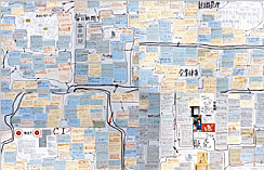
All the problems and issues besetting this major national newspaper were subjected to detail analysis.
This CI project proceeded to turn "newspaper revolution" into a watchword. Blow-by-blow accounts of this process did the rounds in-house.
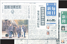
PAOS reviewed everything: from page format to layout system, the way in which articles were written and photographs shot, but most symbolic was the change to the newspaper flag. Usually an intelligent blue, it was colored green exclusively for "Greenery Day" (May 4).
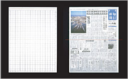
Sweeping changes were also made to the layout format.

Initial surveys revealed that the Mainichi's "lack of image" was its most outstanding feature. The breakthrough to this problem came with the blue newspaper flag.
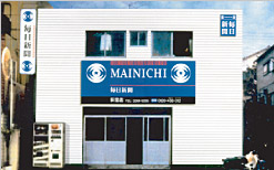
Another major undertaking in shedding the Mainichi's stodgy image was the remodeling of the delivery agencies.
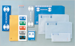
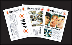
A selection of novelties carrying the "Mainichi no Me" (daily eye) logo
![]()
![[method] The PAOS Method](../common/images/workMenu/method.gif)
![[study] PAOS' Research and Application Projects](../common/images/workMenu/study.gif)