

![]()
![]() Place your cursor over the logo to reveal its former incarnation.
Place your cursor over the logo to reveal its former incarnation.
When Toray Industries first approached PAOS it was bereft of the climate and marketing mindset necessary to identifying ways of putting its abundant development capabilities to use in business. The question as to whether it would be possible to realize the potential represented by the outstanding capabilities of this blue-chip company in a more business-oriented fashion was answered in the form of "new businesses" that grew out of a company-wide campaign to conceive "Toray-style CI" as the "new Toray". The symbolic gesture encapsulated in the corporate goal of creating new values that would guide people to a life of affluence generated a new philosophy, led the company to change its brand name to the current English language appellation and to the development of a new logo design. This enabled the new Toray to begin seeking cultural change, to guide its employees to the belief that Toray was not simply an advanced upstream fabric manufacturer, but that it had the potential to expand into midstream and downstream areas. This led to the establishment of a new corporate identity that had its roots in the development of new ideals.
Toray's biggest management resource was its new fabric development capabilities. The goal, starting with the development of a company philosophy, was to affect a shakeup that would enable Toray to exploit and enhance its entrepreneurial abilities in all areas of the industry.
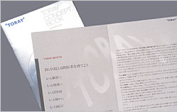
A monument to the new philosophy was built at the Shiga office (Toray's applied research institute).
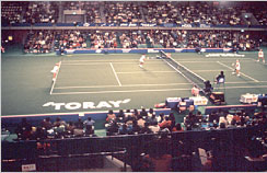
The Toray Pan Pacific Open is a significant event in the international tennis calendar.

To ensure that the giant signboard atop the Mishima plant would be clearly visible from the bullet train the design was kept very simple even as the company's vested interests were given rein.
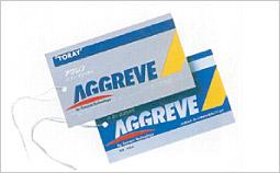
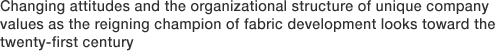
Model designs developed for a distinctive product brand.
![[method] The PAOS Method](../common/images/workMenu/method.gif)
![[study] PAOS' Research and Application Projects](../common/images/workMenu/study.gif)